David Einwaller
A Non-Reader for people who like to look at letters
- Kategorie
- Honorary Appreciation
Begründung der Jury
★
Austria /// Österreich
★
This book is definitely aimed at designers, at typography lovers. The book title already makes it clear. The publication “A Non-Reader for people who like to look at letters” by type designer David Einwaller is a small, unpretentious paperback book that was self-published. It follows the old tradition of the so-called specimen, which are sample books in which designers present and promote their typefaces. Einwaller charmingly continues this work in the unusual form of a paperback. It comes in a small, handy and unagitated format. The use of black and white is more than sufficient here.
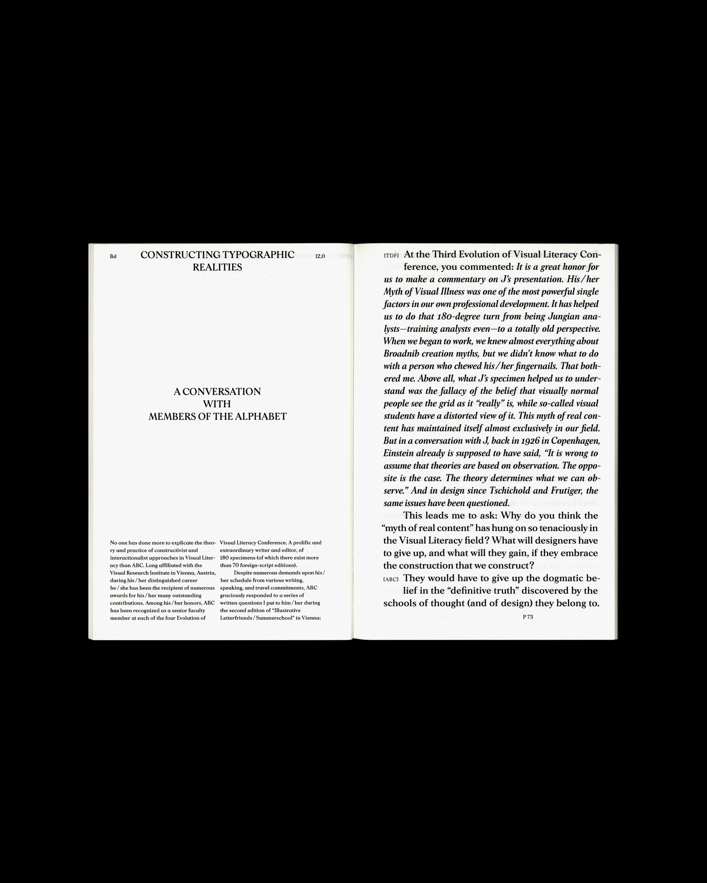
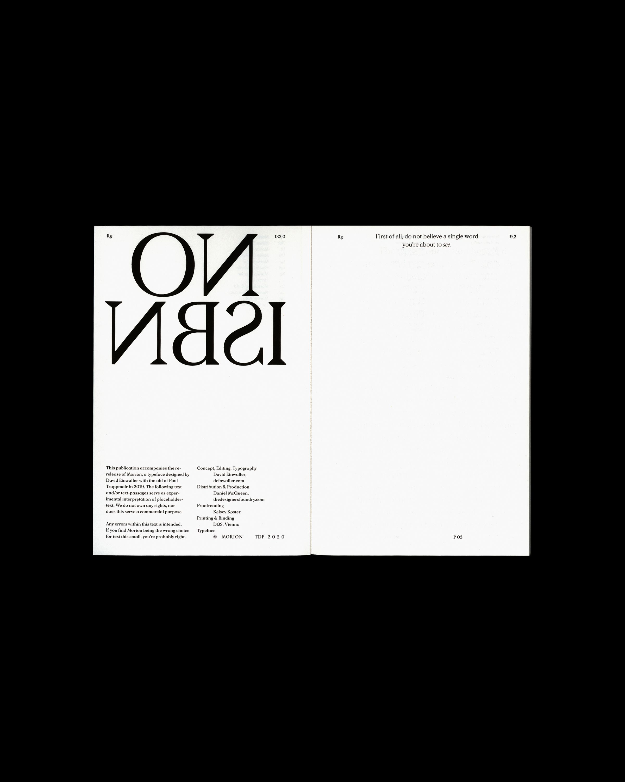
The small volume is entirely devoted to Einwaller’s self-developed typeface Morion. It presents it in its various fields of application, and in the process you stumble across numerous nice little surprises.
Typography, actually a carrier of content, becomes the content itself here. Humour is also a carrier of information. The book becomes an exhibition space for the typeface, which uses the space provided to let off steam in all its possibili-ties and invites readers to direct their senses to the visual appearance of letters – and not to their content.
David Einwaller’s publication convinces through its elegant simplicity and shows that the most beautiful books do not have to stand out through special printing or binding processes, but through a coherent combination of content, form and function. Reduction makes its contribution here in the right spots.


