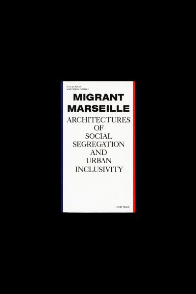
Migrant Marseille
- Kategorie
- Honorary Appreciation
Begründung der Jury
★
Germany /// Deutschland
★
Large-scale immigration has shaped the city of Marseille. This compact paperback explores the urbanistic causes for the uneasy coexistence between natives and migrants – while also pointing the way towards a more inclusive urban planning. It’s a handbook whose sober and pragmatic approach is matched by a similarly sober and pragmatic design. In a very good way. This compendium feels light even if the content is not. Format, volume, weight, great! The format defines the flow, an invitation to dive into the topic.
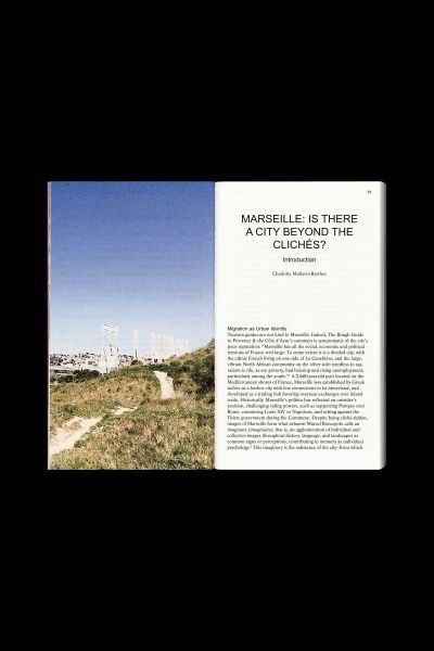
Thin pages bound by dispersion glue make it easy to handle, with the book falling open almost by itself, while precisely delineated isometric drawings offer overviews of the city’s sprawling housing projects. Here, one is reminded of the rigour of Le Corbusier’s vision of open spaces in dense cities, and of the way social realities have given such idealistic plans a very different face. The aesthetic of those realities is documented via uncommented street photography, the analytical texts being backed up by images from on-the-ground explorations.
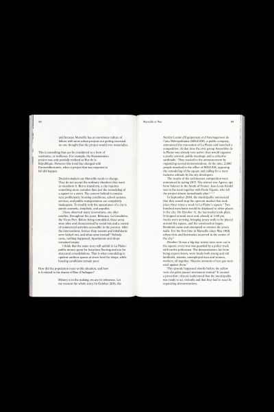
A similarly unflinching approach can be seen in the typography. Almost unbelievably for a printed book, headings are in upper case Arial, a secretarial font the use of which requires both conviction and a feel for the subject matter. Further evidence of both can be seen in the typeface for the body matter: here the designers chose Life, a suitably lively derivative of the evergreen Times. There is nothing wrong with the decisions of type, not at all.


