Kuan-Ting, Chen
Met Stoelen
- category
- Gold Medal
jury statement
★★★★
The Netherlands /// Niederlande
★★★★
It is hard to believe that this book project is a student work. A painfully well-made book, but calling it a book object is more accurate in this case. The Japanese binding was chosen to create its specific size. In this way the book becomes kind of friendly, soft, and fluffy. Using Japanese binding would also allow printing over the edges of the pages, but these remain plain. Some extreme choices were made for the present project. Decisions that make this publication so extraordinary.
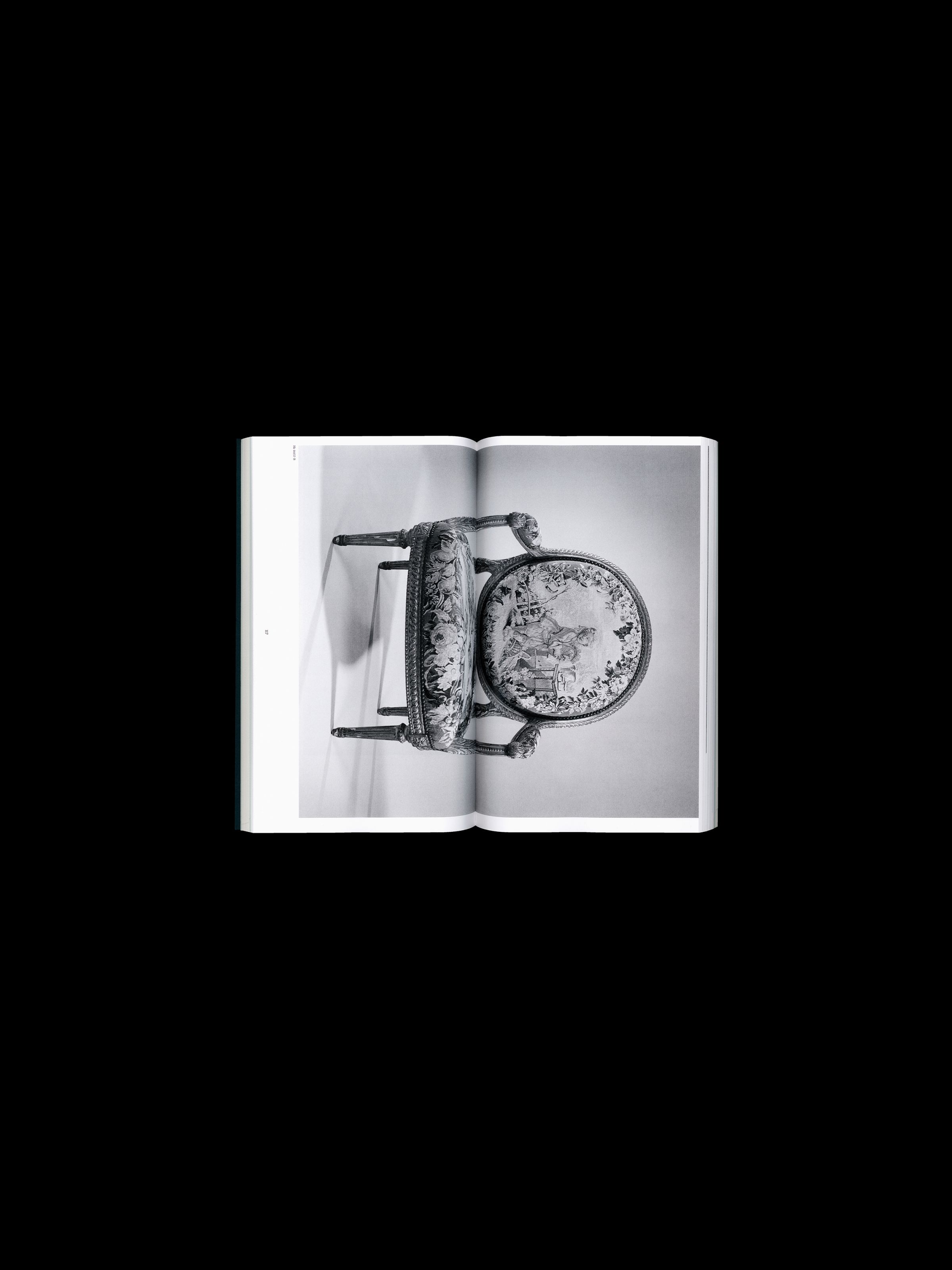
For editorial designers, the middle of a double-page spread is one of the most vulnerable parts. A lot can be done wrong in the layout, but also in the printing and binding process. Information can be swallowed up. Here, however, this sore spot becomes the main actor. The chosen layout embraces the books fold. Most of the chair photographs used are tilted and run across the middle of the double-page spread, thus being bisected and somewhat swallowed up, but also awakening a completely new way of seeing. The printed chairs become more object-like again, in a deconstructed way. It seems a bit like a metaphor, the chairs are broken. In addition to the many exciting new perspectives that the book casts on the everyday object of the chair, the choice of greyish white paper, the print-colour harmony should also be mentioned. Sitting, cowering, wobbling, slouching, sinking, or maintaining posture. The material specifications of a chair shape our everyday behaviour, both visually and physically.
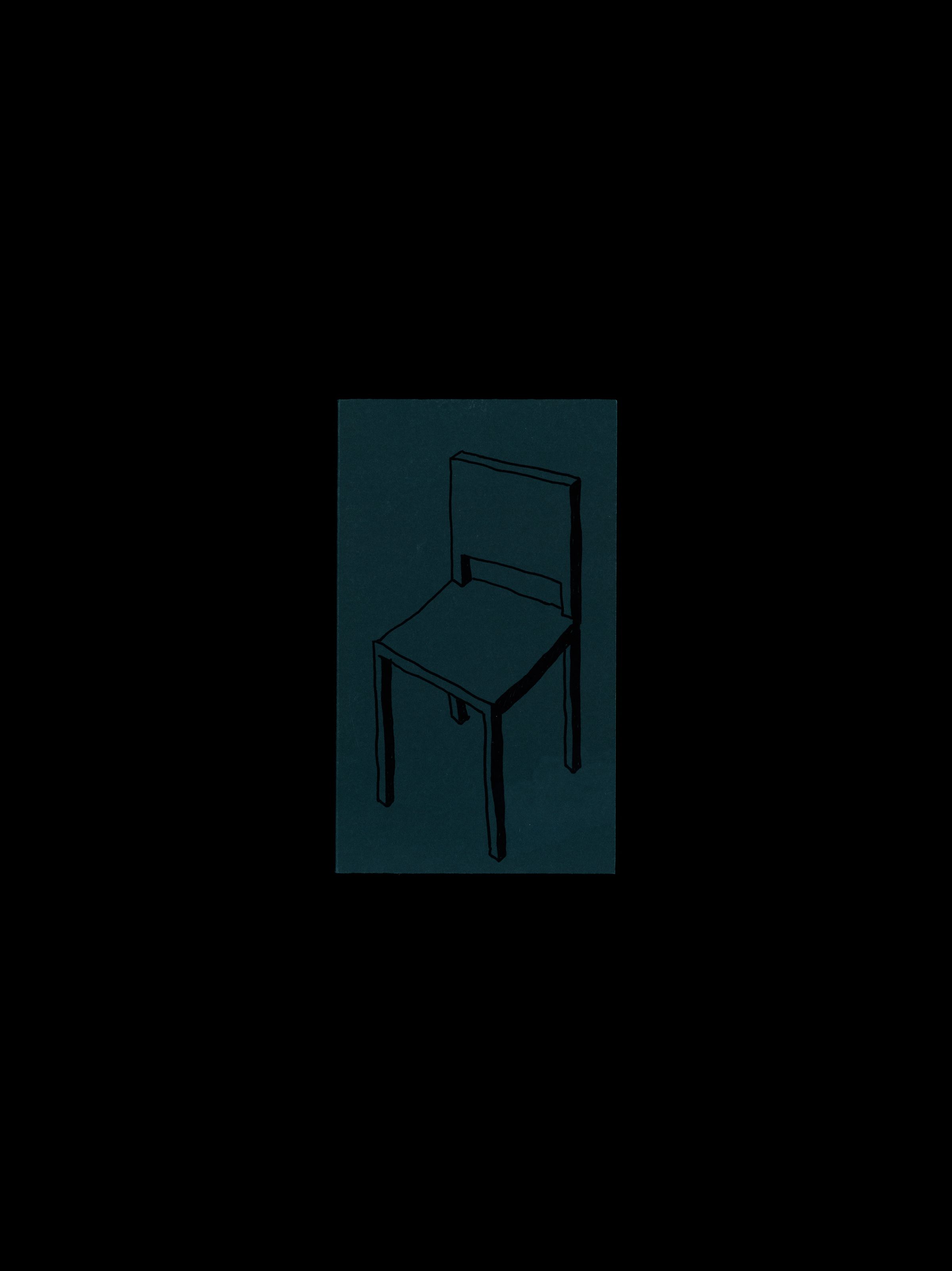
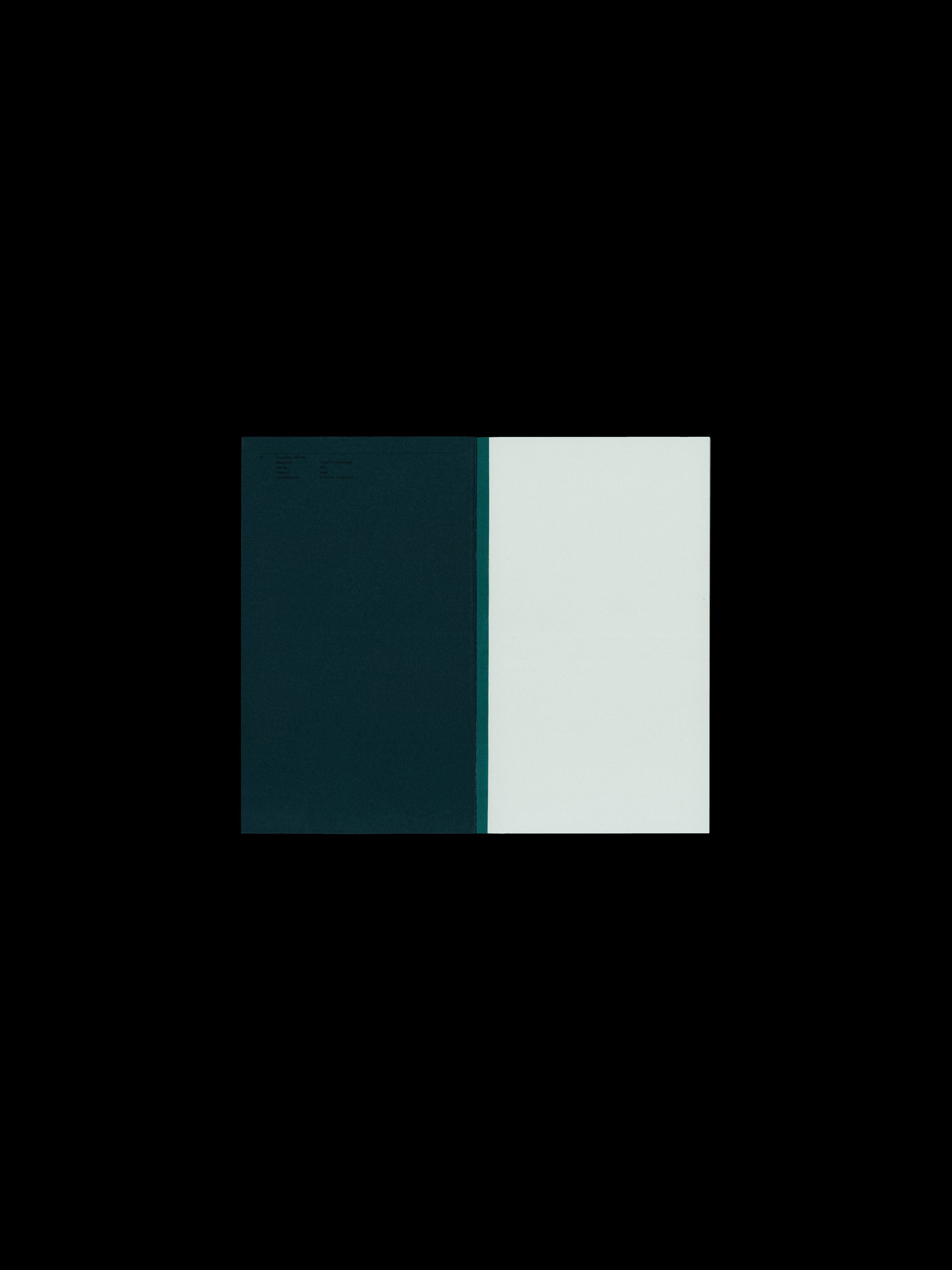
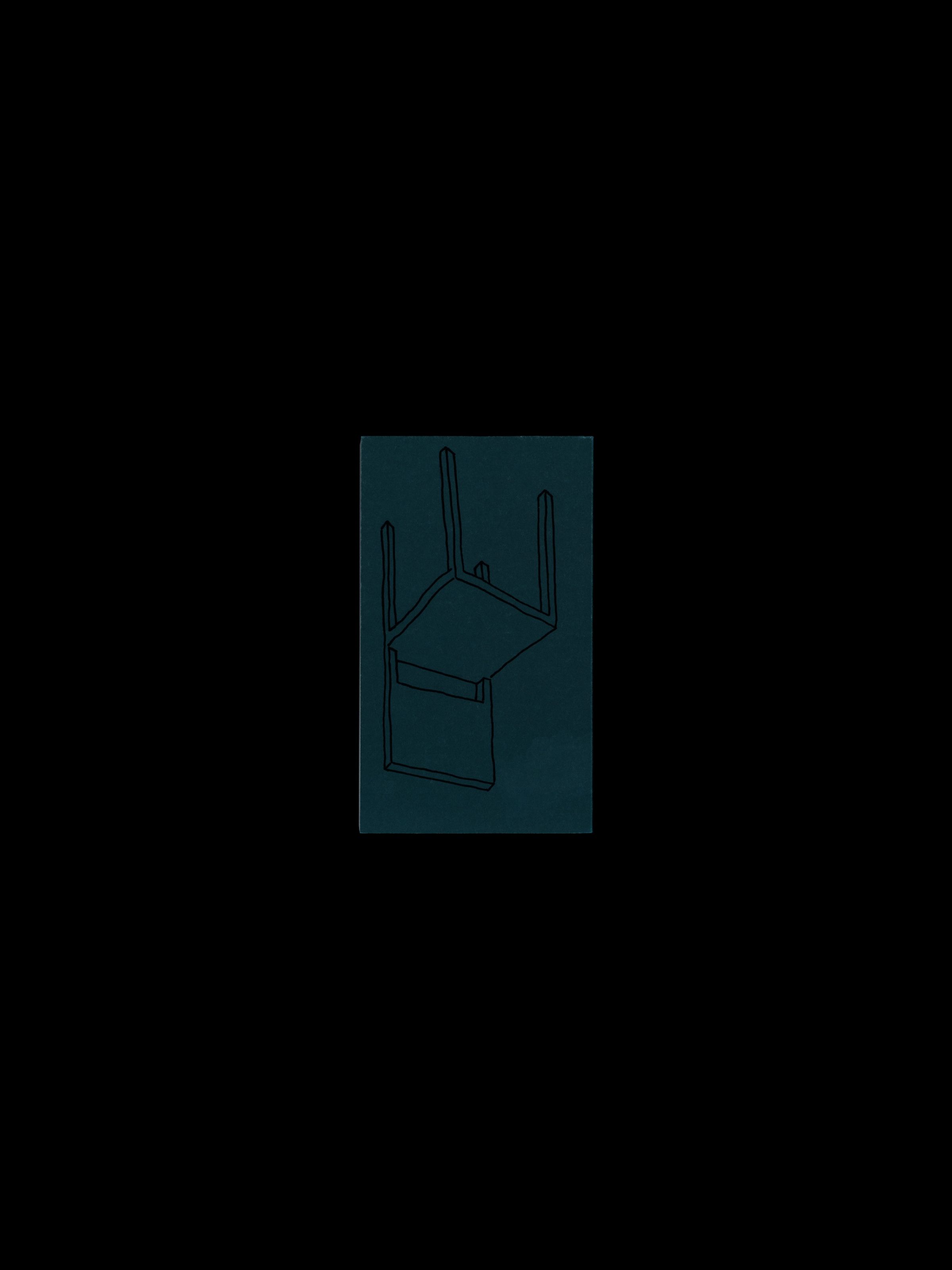
The inviting fir-green cover with a hand-illustrated chair, the plain title only on the spine, contrasts nicely with the study of the seating arrangements.