Nele Dechmann, Fabian Jaggi, Katrin Murbach, Nicola Ruffo
UP UP – Stories of Johannesburg’s Highrises
- category
- Bronze Medal
jury statement
★★
Germany /// Deutschland
★★
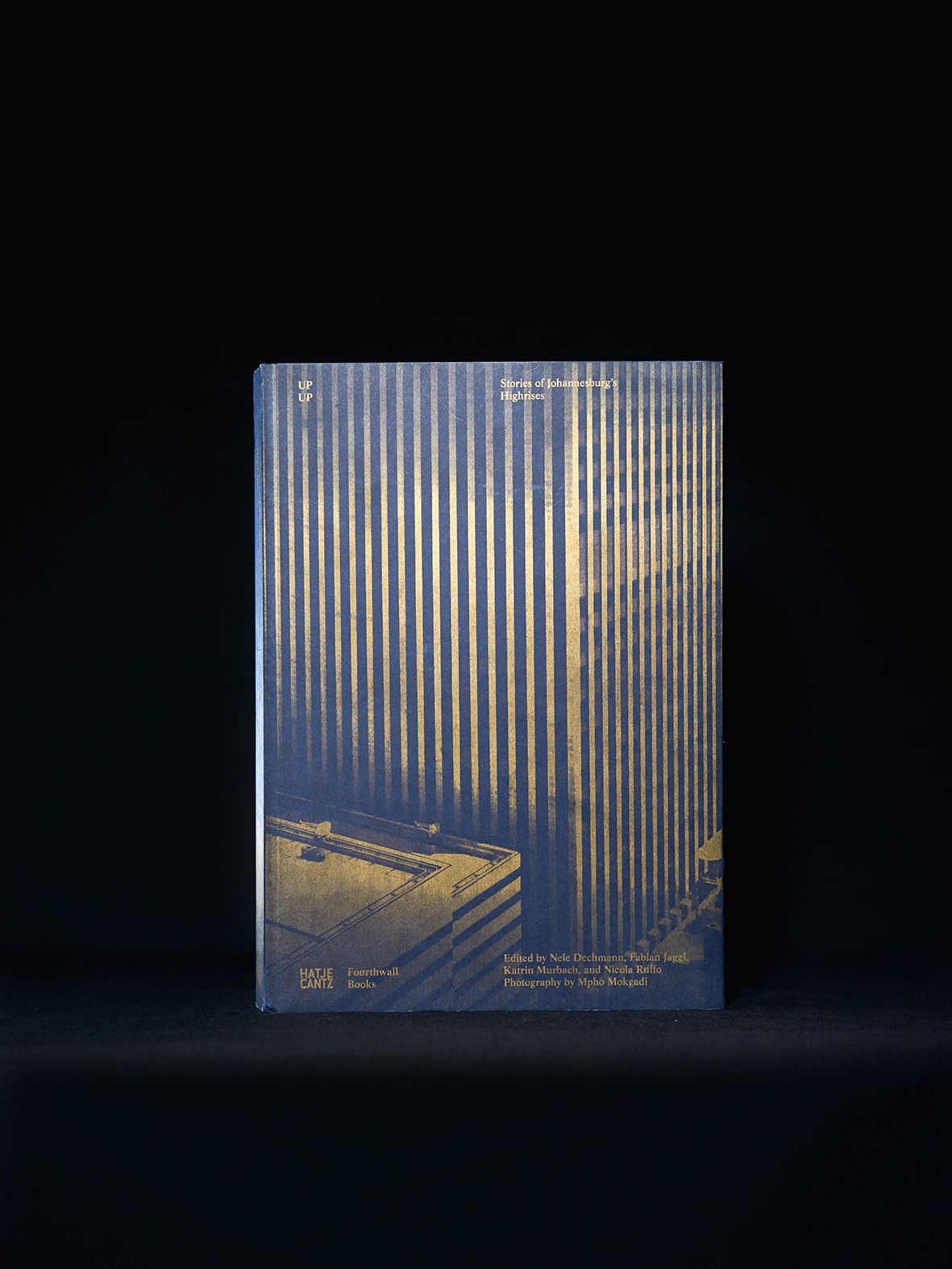
The pages that are slightly smaller immediately catch your eye, even when the book is still lying there unopened. The sheets of paper with the texts are narrower by one centimetre, and so the formal entities separate by themselves the first time they are leafed through as if connected naturally. (This makes the book particularly nice for the user to handle, but particularly elaborate for the producer). On the left, a large picture. On the right—instead of a heading—a statement in large type that would look overexaggerated even as a title. But the fact that this looks like a headline indicates the equality of the interviews/essays with the monochrome architectonic portraits of the buildings: they are excellent architecture photos—historical, documental and contemporary, and the shorter pages of text with bold Baroque Antiqua, which, used in this way, visualises the journalistic impetus of the editorial concept. You could say that composite chapters are created which turn every piece of architecture into a sociological issue.
High-rise architecture from the 20th century in Johannesburg: history, biography receives a location—the building, and building history receives a biographical connection. The design of the foldout cover proves expressive: vertical tectonic structure in golden print on black cardboard.
★★
Die zurückspringenden Seiten fallen sofort ins Auge, auch wenn das Buch noch geschlossen daliegt. Die Papierblätter der Textteile sind einen Zentimeter schmaler, und so teilen sich die formalen Einheiten – wie durch natürliche Fugen – schon beim ersten Durchblättern von alleine. (Für den Benutzer besonders handgreiflich, für den Hersteller besonders aufwändig.) Links steht ein großes Bild, rechts – statt einer Überschrift – eine Aussage in so großer Type, wie sie selbst als Titel übertrieben wirken würde. Aber die visuelle Schlagzeilenqualität weist auf die Gleichwertigkeit der Interviews und Essays mit den architektonischen Schwarz-weiß-Porträts der Bauwerke: tolle Architekturfotos – historisch, dokumentarisch und zeitgenössisch – und die kürzeren Textseiten mit der fetten Barockantiqua, die so, wie sie verwendet wird, den journalistischen Impetus des redaktionellen Konzepts sichtbar macht. Man könnte sagen, es entstehen Komposit-Kapitel, die aus jeder Architektur einen soziologischen Fall machen.
Hochhausarchitektur des zwanzigsten Jahrhunderts in Johannesburg: Geschichte, Lebensgeschichte bekommt einen Ort – das Bauwerk, die Baugeschichte bekommt eine biografische Beziehung. Die Gestaltung des Klappenumschlags erweist sich als sprechend: Vertikale tektonische Struktur in goldenem Druck auf schwarzem Karton.