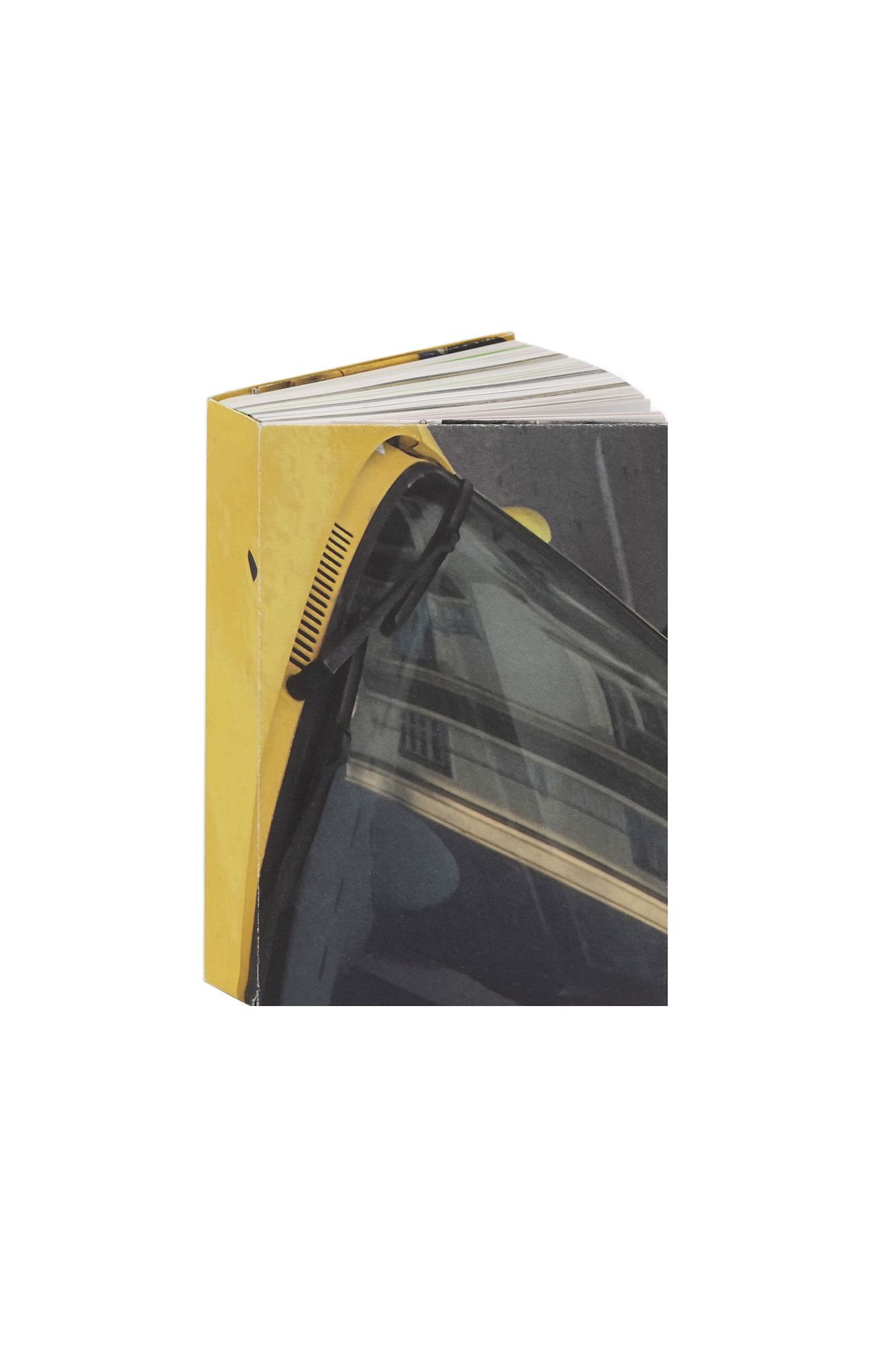
Studierende des Fachbereichs Bühnenbild/Szenischer Raum der HfG Offenbach / Marc Ries, Fanti Baum u.a.
Ein recht großes Stück Himmel
- Kategorie
- Allgemeine Literatur
Begründung der Jury
„Ein Buch zum Flanieren“, schwärmten die Jurorinnen und Juroren, als sie „Ein recht großes Stück Himmel“ näher begutachteten. Dabei ist bereits der gefaltete Druckbogen als Schutzumschlag ein charmantes Detail, das sich in das ganzheitliche Konzept des unprätentiösen Künstlerbuches einfügt. So zugänglich und harmonisch Format, Schriftwahl und Satz zusammenspielen, so herausfordernd ist der Inhalt: Handelt es sich doch „um ein Experiment, die Unmöglichkeit des Verstehens von Raum zu unterrichten“, wie im Nachwort zu erfahren ist. Zuvor lässt man sich allzu gerne treiben, bleibt an den Beobachtungen und den Essays hängen und taucht in die zugehörigen Fotostrecken ein.
Entstanden aus einer Bühnenbild-Exkursion nach Athen, wurden die Texte gestalterisch gleichwertig auf Griechisch und Deutsch gesetzt – Schriftwahl und Zeilendurchschuss erzeugen dabei ein austariertes typografisches Bild. Die Reduktion auf das Wesentliche gibt dabei den starken konzeptionellen Ideen den nötigen Raum. So mögen beispielsweise die eingebundenen unbedruckten, farbigen Papiere auf den ersten Blick lediglich zum attraktiven offenen Rücken beitragen und als Trennerseiten dienen. Tatsächlich offenbaren sie sich jedoch als tragendes Element der atmosphärischen Dramaturgie. „Die Idee, die Papierfarben im hinteren Buchteil zu erklären, ist großartig“, befand die Jury, die zudem von der buchbinderischen Qualität des Werkes überzeugt war. „Die Gestaltung und Ausstattung machen Lust, das Buch zu nutzen und es zu erkunden. Es ist fast wie eine Zeitung im Buchformat – ein schönes Objekt“, so die Jurorinnen und Juroren. Literatur, die durch ihre Materialität beeindruckend tief und vielschichtig wird, obwohl sich laut Nachwort „im Grunde nichts ereignet“.
///
“A book you want to peruse at leisure”, enthused our judges on closer inspection of this unpretentious artist’s book. The first charming detail comes courtesy of the dust jacket, which consists of a folded sheet of continuous-feed paper and is very much of a piece with the overall design. The format, fonts and typesetting may be accessible and cohesive, but the book’s content is rather more challenging, being “an experiment in teaching the impossibility of spatial understanding”, at least according to the afterword. Nonetheless, readers can simply go with the flow, pausing at the various observations and essays and delving into the corresponding photo sequences.
Born out of a trip to Athens that formed part of a stage design seminar, the text is in Greek and German, with each language given equal visual weight. Together, the chosen typefaces and line spacing lend the typography a finely balanced look, while the pared-down aesthetic gives the strong conceptual ideas room to breathe. The blank bound-in colour sheets, for instance, seem at first glance to serve merely to enhance the attractive open spine and act as dividers. In fact, they turn out to be an integral part of the dramaturgical mood. “Including an explanation of the paper colours at the back is a brilliant idea”, remarked the judges, who were also impressed by the quality of the bookbinding. “The book’s design and production make you want to use and explore it”, they added. “Almost like a newspaper but in book format, it’s an aesthetically pleasing thing.” This is a title whose materiality lends it an impressive and multilayered depth, despite the fact that, as the afterword says, “essentially nothing happens”.